
Proposed state
Client: Cherry Street Coffee House
My Roles: UI Designer, Information Architect, Project Manager
Duration: 2 weeks
Platform: iOS Mobile App
Tools: Sketch, LucidChart, Adobe PhotoShop & Illustrator
OVERVIEW
CLIENT
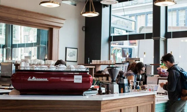
Cherry Street Coffee House is a local coffee chain in Seattle. They pride themselves in pioneering the Seattle coffee scene for over 20 years, which is now known as the “Mecca of Coffee”.
CHALLENGE
Users want some kind of loyalty program that helps them earn and redeem rewards through the mobile app for convenience. They also found the menu to be cumbersome as the products were grouped in very specific categories. They said the search and ordering process took too long because they had to click through every category.

Current state
DESIGN RESEARCH

UX Research and persona done by Mark Hwang
PERSONA
Everett is a busy 30 yrs. old account manager of an advertising company. He values consistency and likes life to be straight forward and organized. He is a passive person, when learning new information, he hopes that someone will just give him all the details instead of searching them by himself.
Pain points:
Unorganized Interface
Unclear buttons and functions
Long and complex ordering process
Redundant and cluttered content

CARD SORT
After gathering and analyzing the research and understanding the persona’s needs and pain points, I did an open card sort where users categorized what made sense to them. I have omitted some navigations and added in extra navigations such as “rewards program” and “promotions” as this is what the research has pointed out.


From the mental models of the card sorting, it has shown that the majority of the participants have grouped up the different types of menu items instead of having them all under one long list. With that I made sure those mental models were carried over onto the site map.
SITE MAP
Following of the persona, Everett needs an organized and understandable navigation with an easy way to find promotions and menu items. I also kept the number of navigation links to a minimum to fit for a small mobile screen.

PROPOSED SOLUTION
Simplify the mobile ordering process
Make the navigation more clear and obvious
Create a loyalty program on the mobile app so customers can conveniently redeem their rewards
DESIGN EXPLORATION
WIREFRAMES
Our Interaction Designer, Brooke Sarcevic, converted her hand sketches into mid-fidelity wireframes and prototype.
User Needs:
Clear and categorized menu
Rewards program to accrue and redeem points for free items
Smoother and quicker mobile ordering process
COMPETITORS
I looked at the following competitors’ mobile app to see how they visually represented mobile food menus and ordering process.
Discovered trends:
Use of brand colors to highlight navigations
Uses the card style to break up and contain content
Have close up of product photos to show details

USER INTERFACE DESIGN
UI STYLE GUIDE
Understanding what I have learned from the competitor’s analysis, with how they visually represent the menus and the hierarchy fonts and style, I have used those insights to create a user interface style guide to be used throughout multiple platforms for Cherry Street Coffee House. Brand colors that are pulled from their own branding on the official website, these will be the primary colors for usage.

USER INTERFACE DESIGN
For the high fidelity mockups, I designed out the main pages that users will interact with the most in Sketch. All the app page designs strictly follow the User Interface Style Guidelines.
Card style are utilized as containers on each page to clearly show the separated sections of information so it’s easier to understand and find what they want to access. The white background is used to help the elements and call-to-actions stand out and be more accessible.


RESULTS
With every user testing, we had each user rate on the usability of the app with the System Usability Scale. For each round we tested three participants, with a total of four rounds. The overall average scoring went up based on the task of going on the app, searching for the menu item, creating an account for the rewards program and checking out.
WHAT I HAVE LEARNED
Users don’t want to scroll a lot on a mobile app and hunt around to find the menu items and product descriptions, especially when they’re constantly on the go. Product images along with descriptions is critical to save time when on the app and trying to accomplish a task
Users typically go on the app to find menu item descriptions since ingredients aren’t listed on the physical menu plaques in stores
Having a loyalty rewards program at user’s convenience gives them an incentive to continually use the mobile app for purchases